Tom Sharp
William Morris
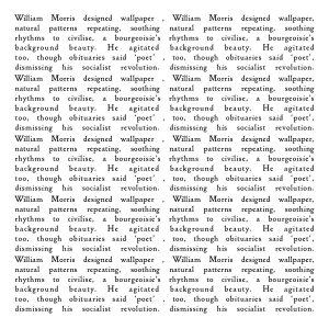
My piece is set in ‘Golden Type’, the serif font designed by William Morris for his Kelmscott Press. The 260 words are made from a single 26 word block, which is repeated ten times. This mirrors the wallpaper printing technique. As you look at the ‘rivers’, the spaces between the words, twisting organic tendril shapes will appear. The commas spiking the central stem mimic the thorns found in some of Morris’s most deceptively placid garden designs. You can read the piece as a single block of 26 words, or in long lines from left to right. Morris made the leap from interior designer to radical socialist, this vital part of his life was glossed over at his death. It seems that, surrounded by inequality and oppression, we prefer to focus on the superficially decorative. William Morris has long been a hero of mine, both in his politics and endless artistic curiosity, and I delighted in revisiting Fiona MacCarthy’s brilliant biography for this project.

